12-2 Rethinking and researching
- Jingyi Loh
- Aug 15, 2021
- 3 min read
Updated: Aug 23, 2021
Week 12

HI. Going through references to gain more insights and ideas
This blog will be analyzing different references and their impact on my ideas
I dig up some references and also archive newer ones shared by my advisors to study how content and information are being delivered and analyze their overall layout.
First section
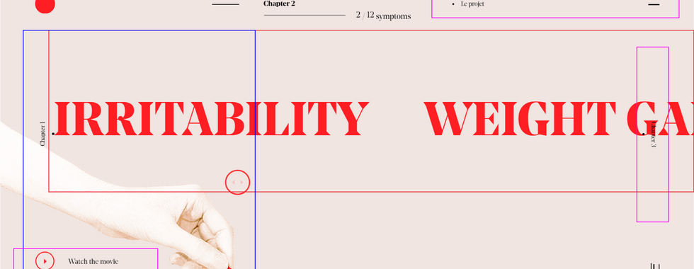
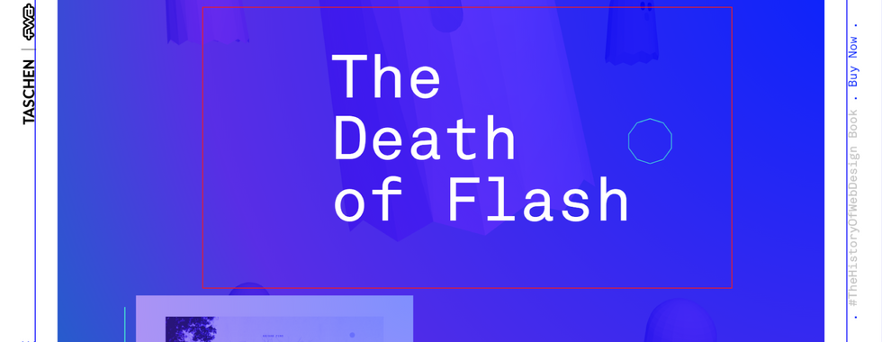
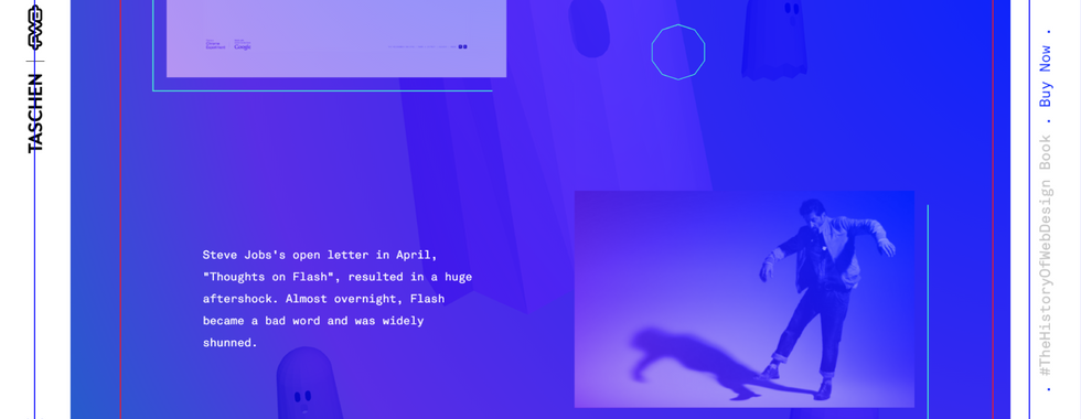
This section would be more on the categorization on how information are being arranged in the website page. The different colors are representing different content;-
Red = Information
Blue = Graphics
Green = Interaction in-within the graphics
Purple = Additional interaction on the webpage
The different colored outline boxes draws out my analysis on these websites.

This website uses 3D graphics as visuals to encourage interaction, when users interact with it, the information is provided through a structured pop-up container.
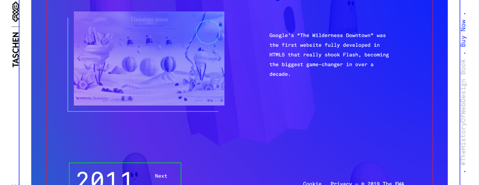
This website is appealing in their text transition and animation. The graphics used are 3D with minor animation at the back. The information are delivered in a more structural way with text.
As for this website, I am mainly studying the 3D graphics transition at the back when users scroll horizontally through the timeline. When users access the information, it is presented in a 2-column grid with images and text.
In this website, I am mainly studying the layout of the information and the vertical scrolling of the timeline presented. Because there are quite a lot of information here, it is helpful to study how they arrange it without looking complicated and messy.
Additional image reference
For the images below, I am studying the arrangement and presentation of 3D graphics with information in a single page. How different information are being presented. This is mainly on the layout because there is no official website for these references.
The first image are mainly design with 3D graphics at the middle and information are being presented at the left and right side of the visuals.
The second image are 3D graphics leaning towards a specific side and the information presented are at the opposite side of the graphics. Some information are also at the bottom.
Second section
This section is not really about the different information being presented in a single webpage, but instead studying the layout hierarchy of how information are being delivered. My advisor shared an attractive website with interesting layout that is worth studying. The colors represent different levels;-
Yellow = First level // Primary attraction
Blue = Second level // Secondary attraction
Purple = Third level // Minor attraction

This website is mainly introducing canals in Amsterdam throughout different eras. It is a information-based website that uses text and images to present information. I find the layout interesting because there are different font sizes in one single page and it is being designed in an appealing way. Occasionally, there are also images appearing at supporting material. This website can be navigate through a horizontal manner by either scrolling or dragging.
Studying the different references definitely inspired me more on how to present the information for my microsite, however, because the references that have 3D graphics are not really presenting an entire 3D space but instead just one single 3D object. This also means that they have more empty space to easily arrange information without worrying too much about the visibility. By the study of the content layout and layout hierarchy is definitely helpful, hopefully I will be able to quickly come up with ideas on presenting the content layout.
That's all for now, in the next blog, I will be updating further progress on my technical prototype and refined content layout.











Comments